KIM KOREAN KIMBAP RESTAURANT
Creative Direction, Branding, Design, Animation
KIM’s focus is on kimbap, an iconic dish from South Korea that is very popular due to its convenient shape and healthy ingredients. This dish is usually part of a packed lunchbox that is eaten outdoors or picnics. Customers can customize their Kimbap and have it ready to go! They can pick their base and ingredients for their Kimbap on the go!
Concept
Kimbap (김밥) is made by rolling various vegetables and protein with rice and seaweed paper to create a visual stunning meal. Some would call it the American equivalent of a sandwich.


Sopoong (소풍) means picnic in Korean!
KIM (김) is the seaweed paper that wraps kimbap
Sketches & Ideation
Final Logo Variation


Logo Animation
Typography

Color Palette

Minimal Memphis shapes were inspired by the mosaic designs of the ingredients when the Kimbap is wrapped up. These shapes are an important basis for the design system.
Design Icons

Business Card


Chopstick Packaging
Visual instructions are provided to create an easy way to use chopsticks.


Packaging
Packaging shape was inspired by School lunches to provide a picnic experience for customers.


Coaster Design
Coasters come in different fun Memphis shapes to accompany the Dining set.

Keeping with the guidelines of the minimal Memphis shapes, I created different illustrations for the appetizers.
Illustrations

The menu is designed to be used as a table mat so the customers can have a clean place to eat if they choose to eat in the outdoors.
Menu

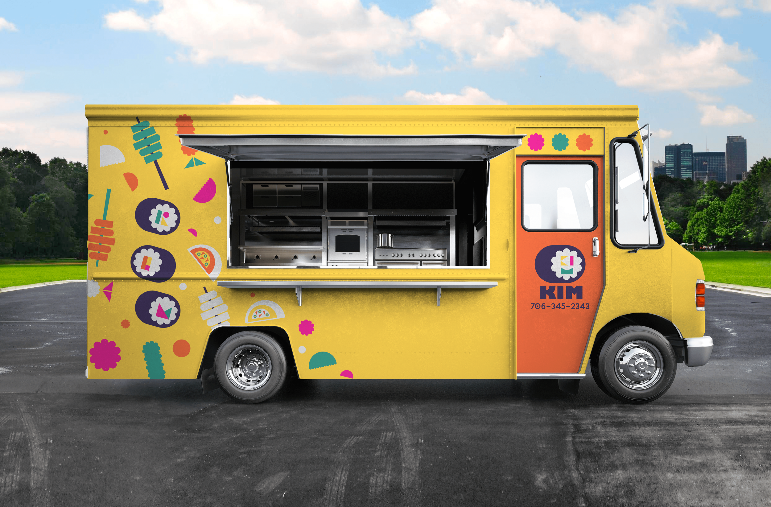
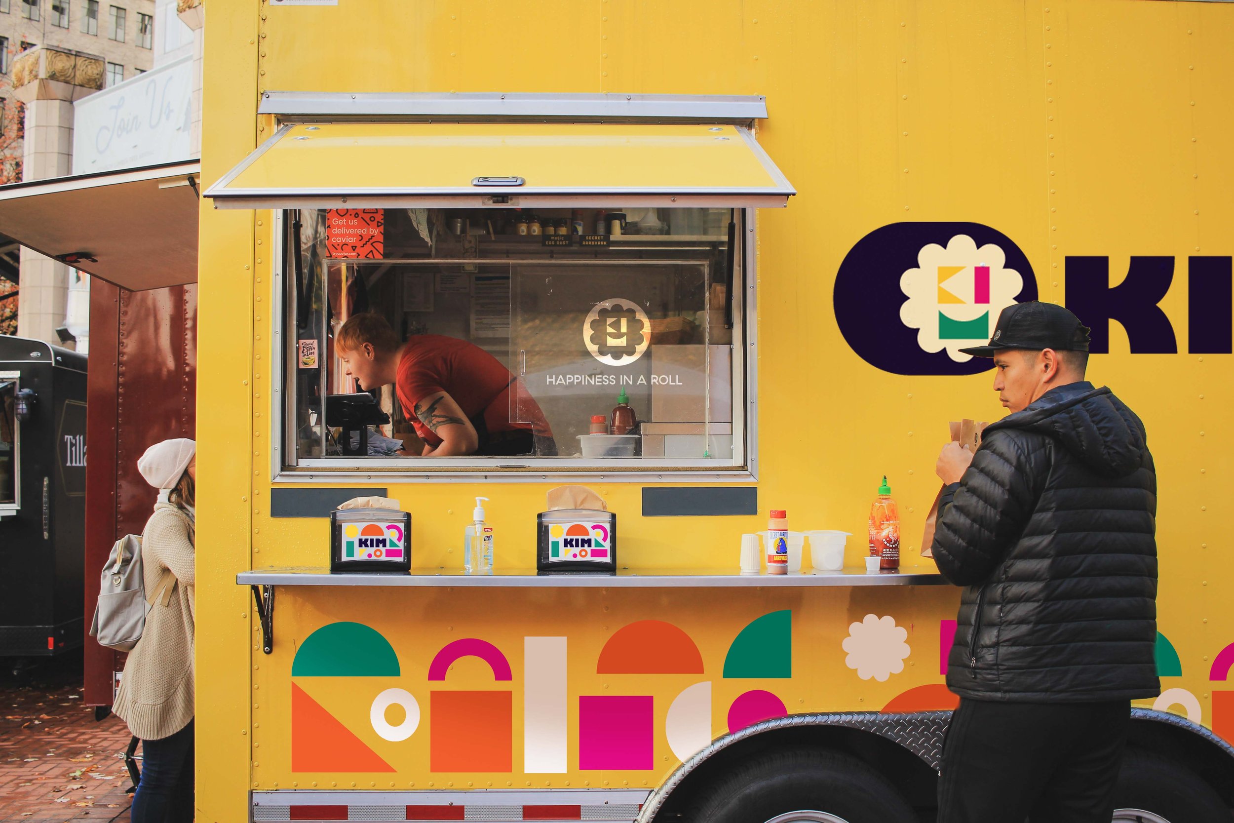
When conceptualizing a place for this restaurant, I decided that a food truck would best serve the message of being a picnic in the outdoors.
Food Truck